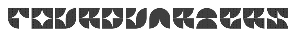
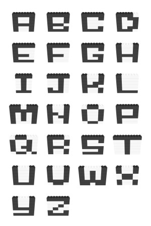
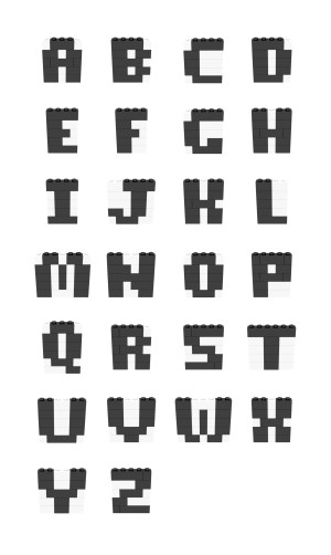
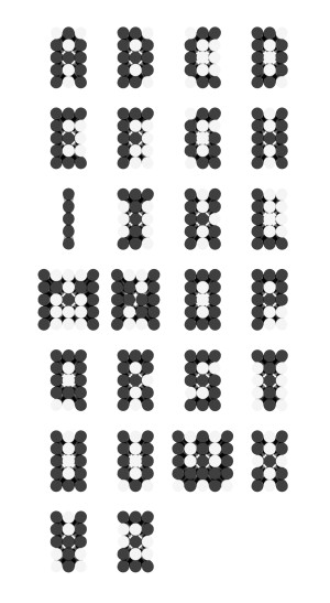
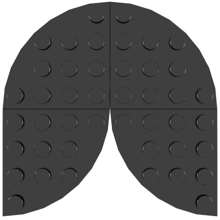
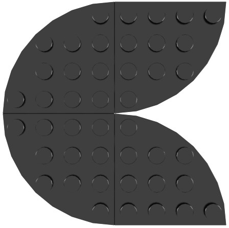
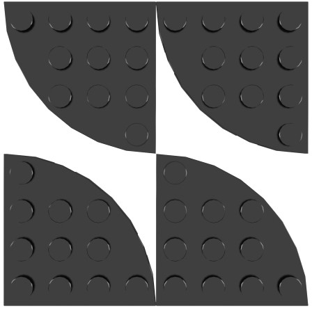
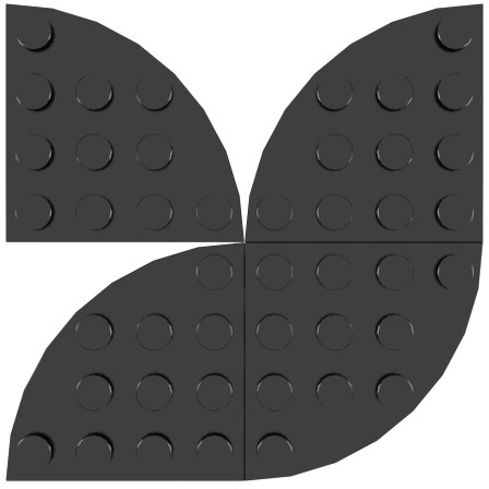
FourQuarters
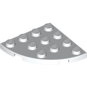
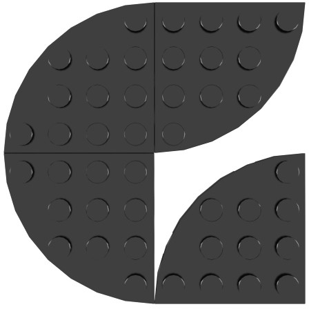
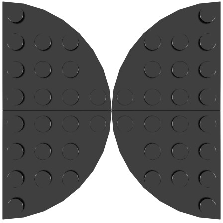
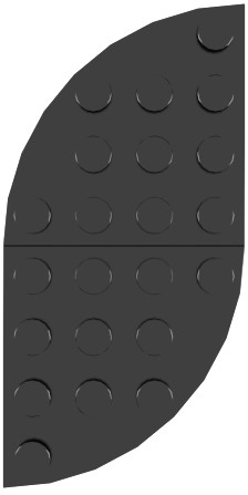
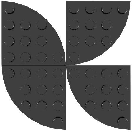
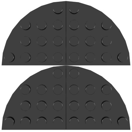
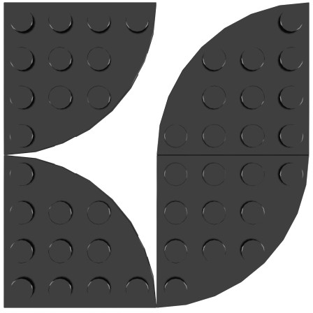
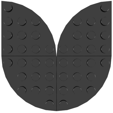
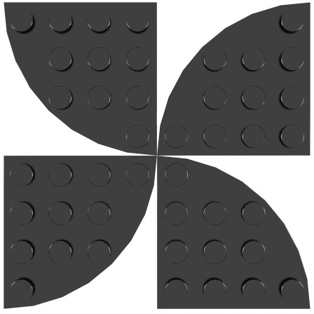
This font is one-of-a-kind. All glyphs are made out of the 4x4 plate corner circle - also known as 30565. All characters except I, M and W are 8 studs wide and 8 studs high. The I is 4 studs wide and M and W is 12.
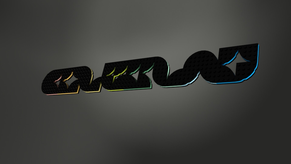
Being constructed from only one type of piece gives the font a very distinct look, reminiscent of older, heavier script fonts or graffiti. If you need a smaller variant you could use the 3x3 plate corner circle (30357) to accomplish the same shapes, though I personally feel this font is better large. If you do decide to go down this road you can create a new font by adding some 2450, allowing for a different look.
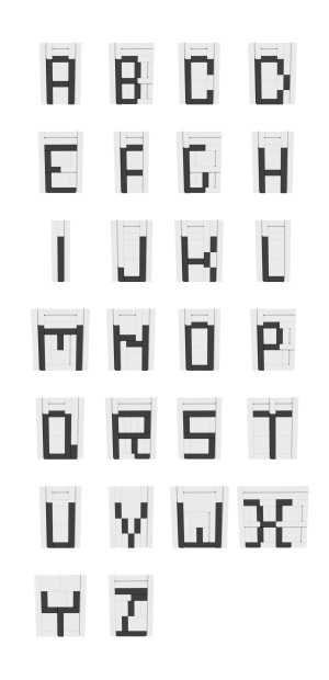
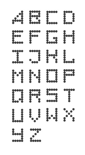
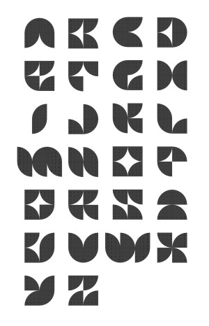
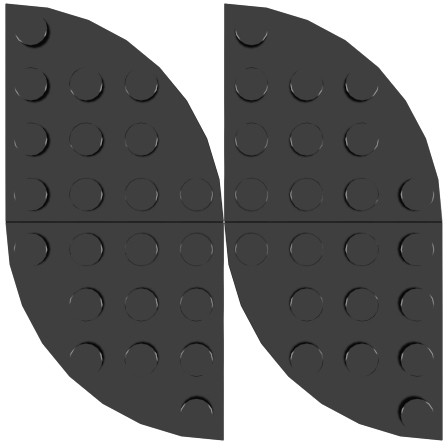
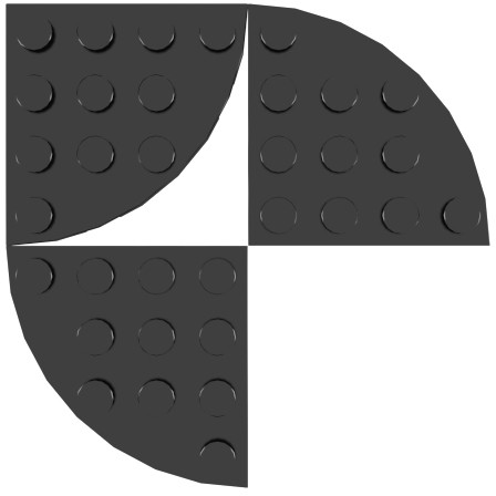
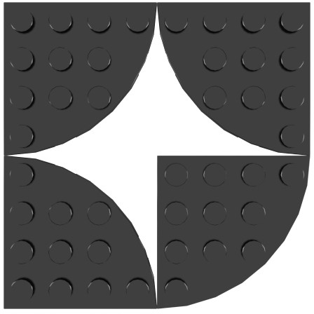
Cole worked on FourQuarters in iterations, and all are available online. Check out picture one, two, three and final to see the font evolve and take shape. Very fun, and a great learning experience too!


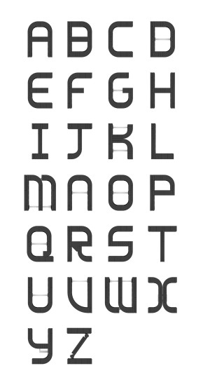
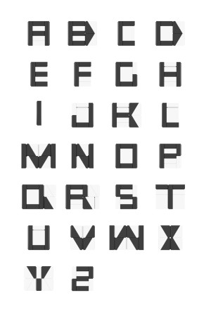
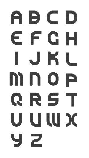
Examples