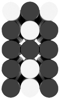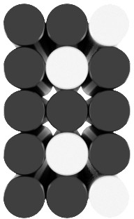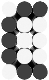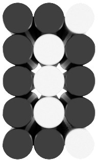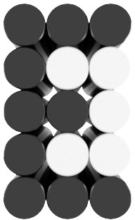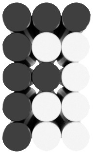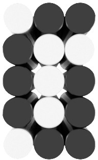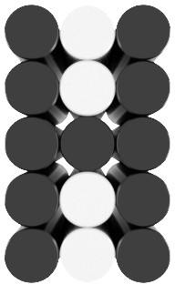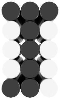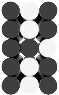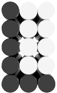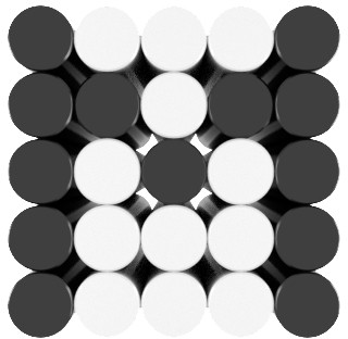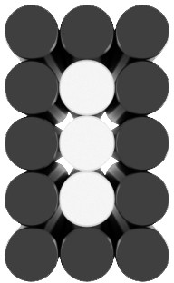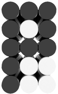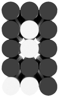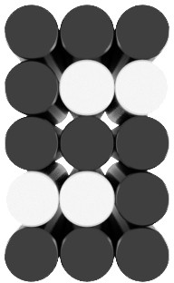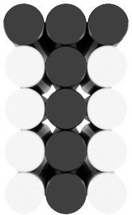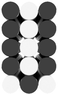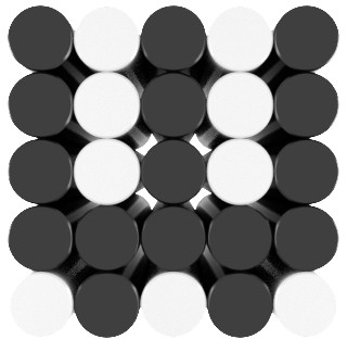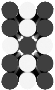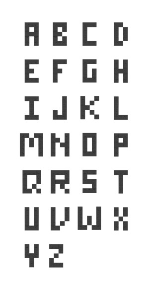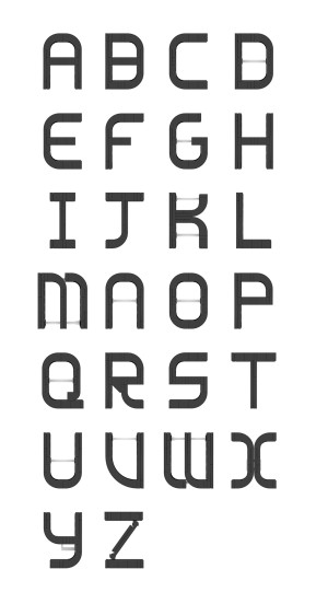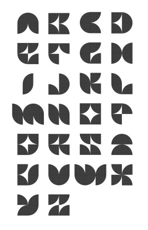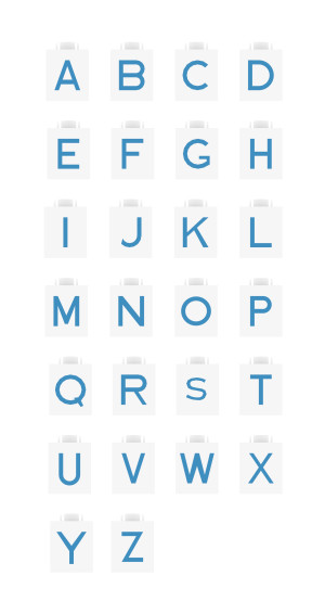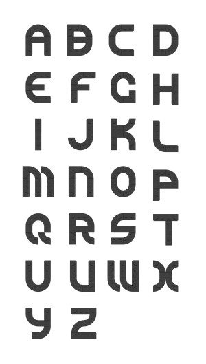
Lightsaber
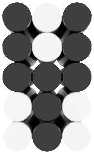
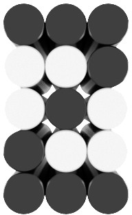
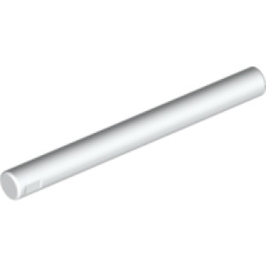
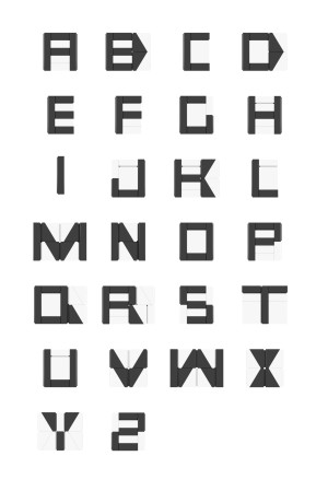
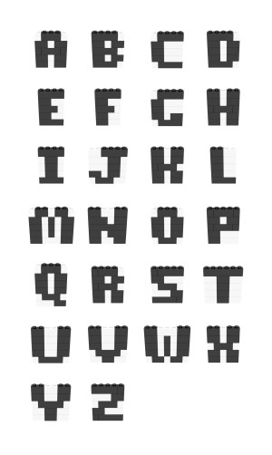
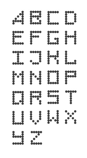
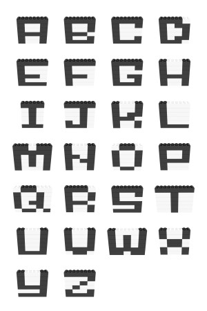
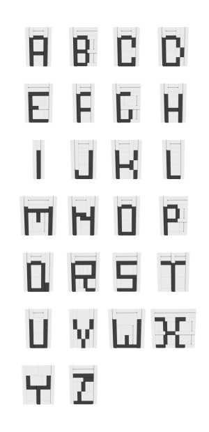
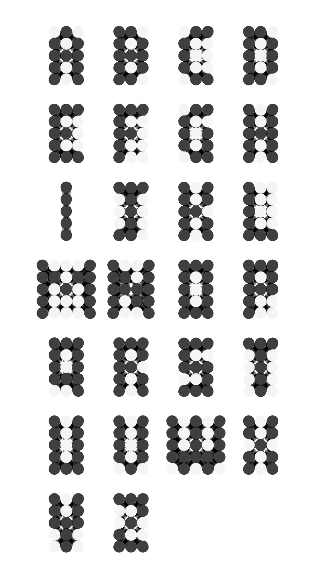
If you ever find yourself with more depth than width and height and need to add expressive lettering, Lightsaber is the LEGO font for you. It's made by rods in a frame which gives it a very cool look.
Putting it together can be a bit tricky, but if you move slowly and build one letter at a time you'll get there. The designer of this font, Jonathan Gale, was even kind enough to put together a spreadsheet to help calculate the parts needed for your particular instance. (Here's a backup if that link stops working.)
Here's how Jonathan himself describes putting it together:
When constructing your phrase, start with a 2 plate thick base of the size you need and then add 1 by X bricks on top leaving 2 stud wide channels for the lightsabers. Make those walls 3 bricks high and then top with a layer of plates and finally a layer of tiles. Add tiles to the base of the channels and you're done!
If you want to backlight it then this is also easily done and only adds 1/2 a plate thickness to the depth of the model. Construct a grid using SNOT style build with trans-clear bricks complete with 2 stud high channels. Then top this with a similar grid studs up constructed of 1 layer of plates, 1 layer of bricks and 1 layer of plates with a layer of tiles to finish it off.
Jonathan is a master at using lightsaber blades for different mosaics. If you like this font I highly recommend looking at his other work - it's stunning craftmanship.
Examples

Lightsaber needs to be encapsulated in bricks to actually stay together, but we can get away from that when we play with digital renders. Besides, doesn't it look really cool like this?
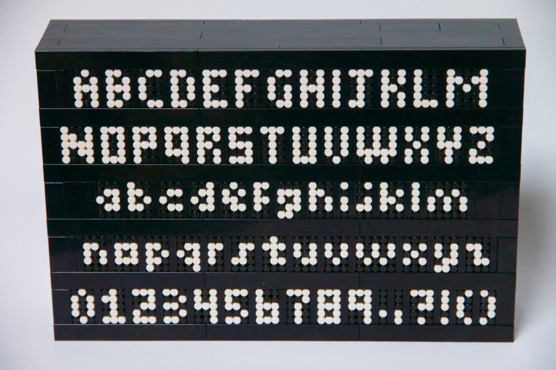
Here's Lightsaber in real life, depicted by it's author Jonathan Gale. He separates each letter with a standing tile. The result is surprisingly sturdy.
