Two High
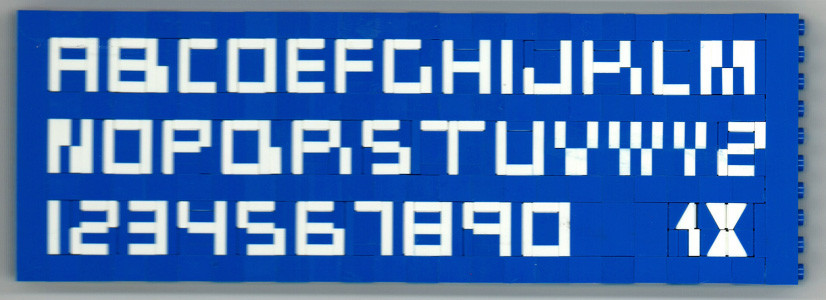
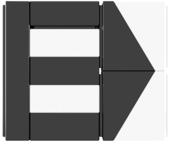
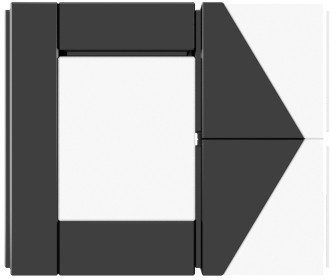
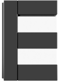
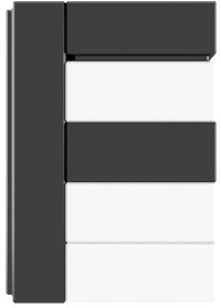
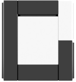
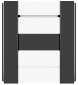
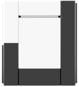
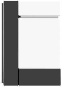
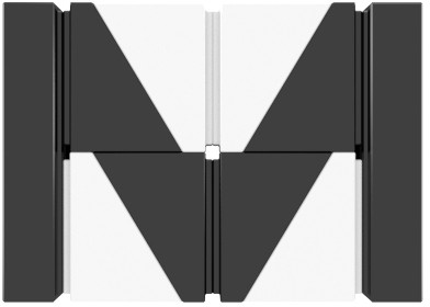
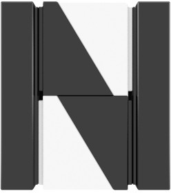
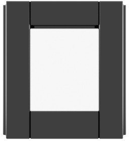
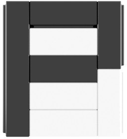
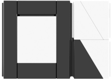
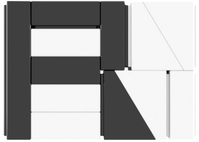
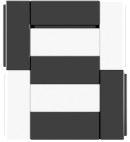
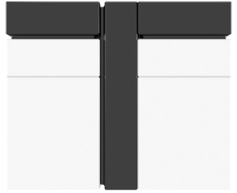
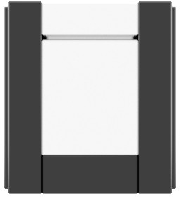
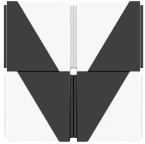
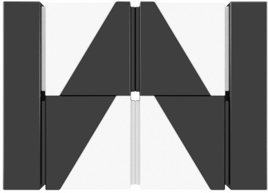
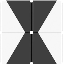
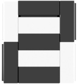
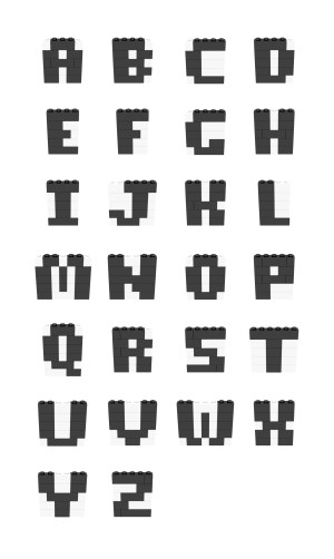
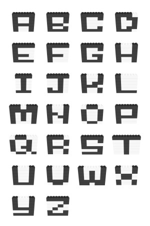
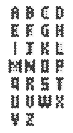
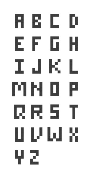
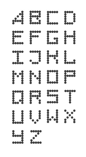
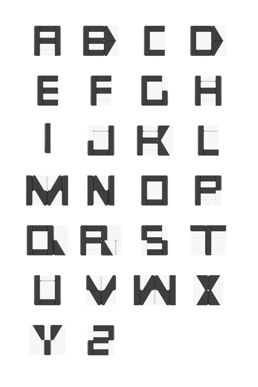
When it comes to writing small, you can't get smaller than Two High. It's name comes from the height - it's two studs high. Oh yes. We went with a pun on this one.
It's a surprisingly expressive font at its scale. The tradeoff, however, is versatility. Many pieces are floating free, so you'll need to treat it as a mosaic which can be limiting. Start by building a frame and place the characters in that. If you're not particularly purist you can use transparent stickers to keep it in place.
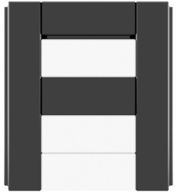
The small scale enables you to do some fun things. The grooves in the tiles becomes a usable feature, for instance! Look at the O. By placing the groove outwards we get a more rounded appearance. The Z remains a tricky character to get 100% right - if you come up with an alternative let me know.
This font has a rich and varied history, which Dan has kindly expanded upon. I first saw it when William Howard posted about it, but variants seems to have been in use by LEGOLAND builders a long time. LEGOLAND Discovery Center Chicago even created a demonstration on YouTube. There's a version in the Ultimate LEGO Book from 1999. The general LEGO community have improved upon it. Contributors include AceBricks, Kockamania.hu, Igor Makarov and myself.
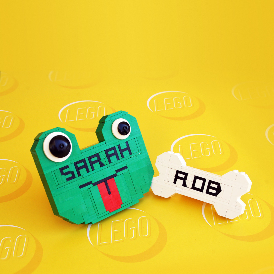
Examples

